To discuss a photo, sign up as a BetterPhoto member or log in.
Coffee
|
|||||||||||
|
|
|||||||||||
|
BetterPhoto Member |
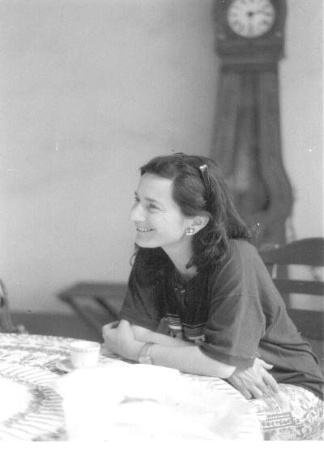
Hi, My name is Solli. I will be very brief; I just joined in your club. I would like your explanation of why such a photo wins. I do not have the time or the energy to explain. All I can say I hope your standart are higher than that. Hot spot on the table; clock out of focus; I hope I did not offend any one.
|
||||||||||
|
|
|||||||||||
BetterPhotoJim.com - Jim Miotke  Contact Jim Miotke Jim Miotke's Gallery |
No, you do not offend - this is a good question. This photo scored high in the photo contest because it was a great example of that kind of photo, a candid portrait. It captured a mood or emotion without appearing fake or unreal. It is true that the clock is out of focus but that only helps; since it is a portrait of a person, we like to see the background blurry and less distracting. The highlights at the bottom of the picture, though, may indeed distract the viewers attention a bit. That is probably one reason why the photo did not win Grand Prize. Overall, though, the judges felt that the photo was natural, beautiful, and one of the better pictures in its genre.
|
||||||||||
|
|
|||||||||||
|
BetterPhoto Member |
What a wonderful photo. I can immediately sense the joy that the subject is feeling. This photo really grabed me. As a response to the previous poster, I think the composition is very good. The background is blurred like it should be, and the photo has a wonderful aged, scratched up look to it. It is a little overblown in the foreground, which is a little distracting, but overall an excelent photograph.
|
||||||||||
|
|
|||||||||||
|
Glenn Theal |
Hi, I also would like to answer to the previous posters remarks. This is a solid photograph. Yes, it is not overly stimulating in colour or shape. However, the composition is wonderfully done as is the settings used to take the photo. The open aperture has placed the BG slightly out of focus, giving attention to the subject at hand. You would not want the clock in focus! However, the BG is not so out of focus so as to destroy the atmosphere created in the photo. You should also take note that the photographer avoided a crucial mistake often made by many amatures. He avoided a merger of the clock with the subject. He also provided the model with viewing room. Notice that he did not cut the image to close to the girl's face, making it look as though she were staring out of the photo. Not all photos can be compared to each other. You cannot compare this type of photo to a sunset or to a macro shot. Each photo must be judged on its own individual merrits within the category to which it belongs. Comparing it to other, perhaps, more unique and exciting photos would be unprofessional. You should also be aware that many aspects are looked at when viewing a photo for quality. Some of these include atmosphere, composition, colour, shape, texture, difficulty of shot, allegory (figurative meaning) and more. Cheers,
|
||||||||||
|
|
|||||||||||
|
Glenn Theal |
I forgot to mention, good photo!
|
||||||||||
|
|
|||||||||||
|
Sue B |
I like the photo and think it is a wonderful portrait. I was drawn into the picture and thought this is what a candid shot should be. She doesn't really need to be identified - she's anyone you've had coffee with and shared a relaxing moment. I also really appreciate the honest comments that Solli made. While I really liked the portrait part of the picture, there IS a distracting I enjoyed viewing the photograph and learned from the comments. Thanks Sue
|
||||||||||
|
|
|||||||||||
|
Patrick R. McMullen |
I love the old look to it very much. It is a very charming and simple photo. Pat
|
||||||||||
|
|
|||||||||||
|
Gregory Dayton |
It captures a great mood, setting and is very real. However it does lack the "wow" factor that most contest winners do have. But I wouldn't know, I've never won one! Nice shot!
|
||||||||||
|
|
|||||||||||
| Log in or sign up to respond or interact. | |||||||||||